"I can see how much the strategy has made, but whether it's currently long or short, in profit or in loss — the interface shows none of it."
Strategy User ATrader running / following strategies
Just like traditional financial markets, traders in crypto markets use an exchange to convert fiat currency (such as USD) into cryptocurrency. The exchange acts as a middleman, completing trades and connecting to the underlying blockchain.
But crypto trading has a high barrier: it usually requires manually watching the market and placing orders, along with a solid understanding of the market. That's where "trading strategies" come in — programs or algorithms that monitor the market and trade more efficiently.
Traders convert fiat to crypto and trade automatically on exchanges via strategies; Crypto Arsenal sits between "strategy" and "exchange" to execute orders.
Crypto Arsenal is a platform that connects directly to exchanges and provides traders with automated strategies. It serves two roles at once, forming a supply-and-demand ecosystem around strategies.
Developers build and list trading bots; traders pick bots to use; returns flow between both sides and the platform.
This model creates value for traders, developers, and the platform alike. However, strategies are not 100% fully automated, so traders often still need to fine-tune them based on market conditions. That's exactly the starting point this "position display and manual close" feature set out to solve.
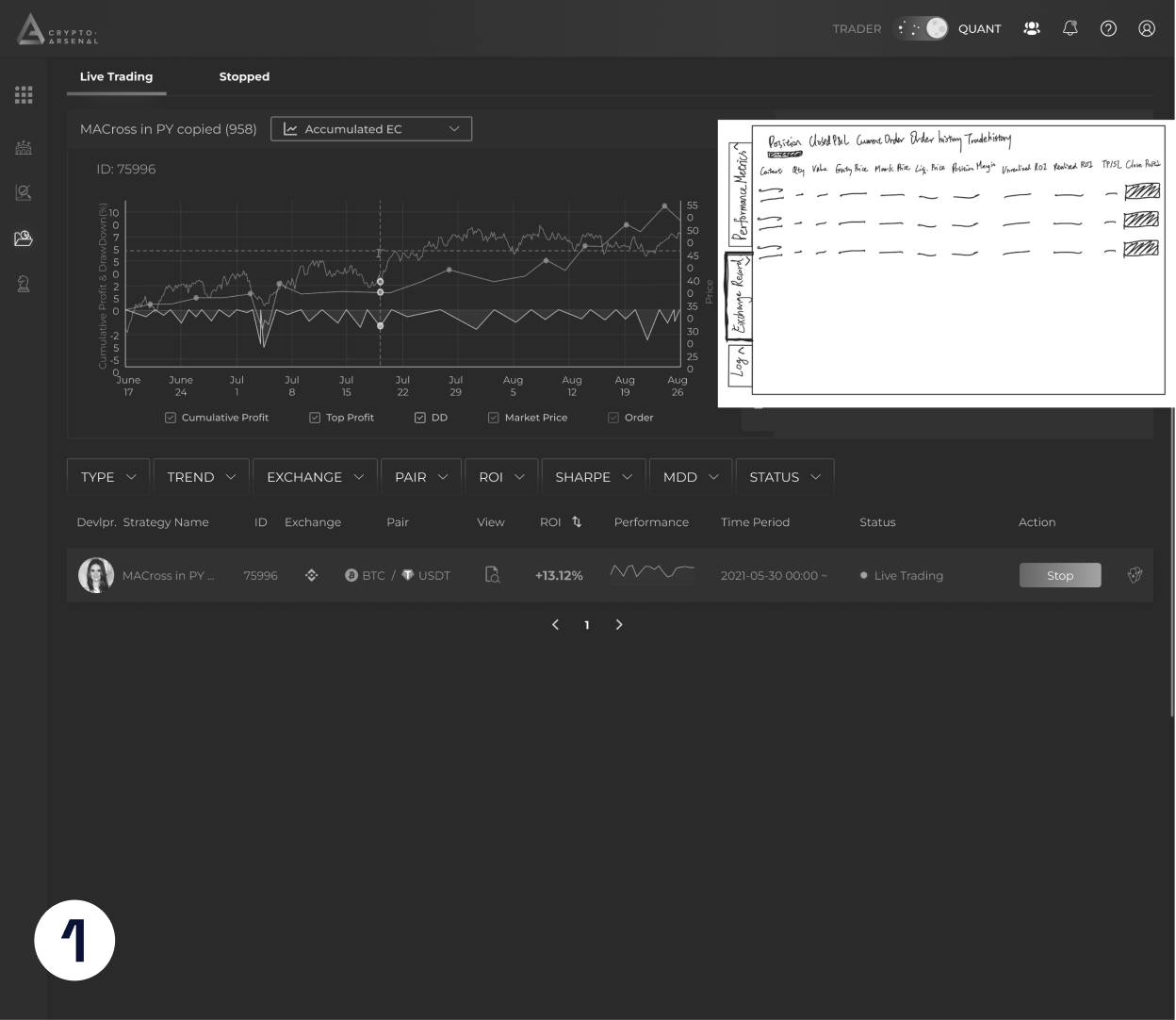
At CA, work ran in 1–2 week sprints — small features took about 2–4 weeks to design, larger ones 1–3 months. Beyond ongoing discussions with the PO on release timing and weekly user feedback, most features were grounded in secondary desk research and competitive design. My design process as a designer was as follows:
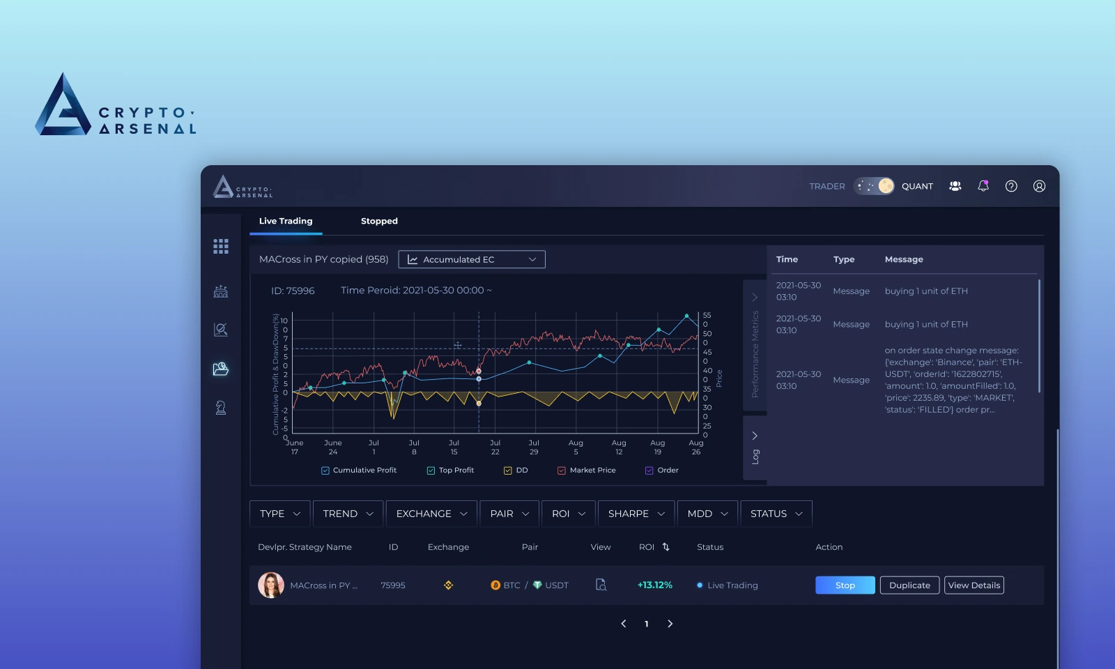
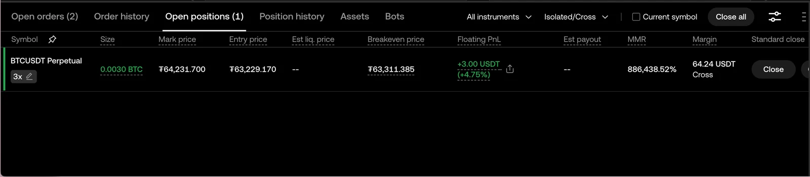
When users trade with strategy bots on CA, they can see the strategy's overall profit, but they cannot clearly understand "what position is open right now." When multiple strategies are running at the same time, or when a single strategy may open either long or short positions, users cannot directly tell whether the current position is long or short, its size, entry price, mark price, floating P&L, margin, or how far it is from take-profit / stop-loss.
"I can see how much the strategy has made, but whether it's currently long or short, in profit or in loss — the interface shows none of it."
"To check positions I have to log in to the exchange, and when I'm running several strategies at once I can't tell which position belongs to which strategy."
"The strategy has take-profit / stop-loss set, but the market moves too fast — I'd like to take profit or cut losses manually rather than wait for the strategy's conditions to trigger."
"I'm already at a profit I'm happy with — I want to lock it in myself instead of waiting for the strategy's set conditions to close."
"I just wanted to close one position early, so I did it on the exchange — and the whole strategy got flagged as abnormal, shut down, and couldn't be recovered."
"I want to know how far the current position is from take-profit / stop-loss, but CA only shows overall performance — I can't see where this position might be closed next."
CA's Portfolio page lets users view all running strategy bots and shows overall performance in the top right — profit, ROI, unrealized ROI, and asset allocation. However, the interface doesn't directly show a single strategy's actual positions: long / short direction, size, entry price, mark price, floating P&L, and margin. To check a single position, users still have to review it on the exchange — so CA, as a strategy-management platform, can't let users fully grasp each strategy's real returns and risk on-site.
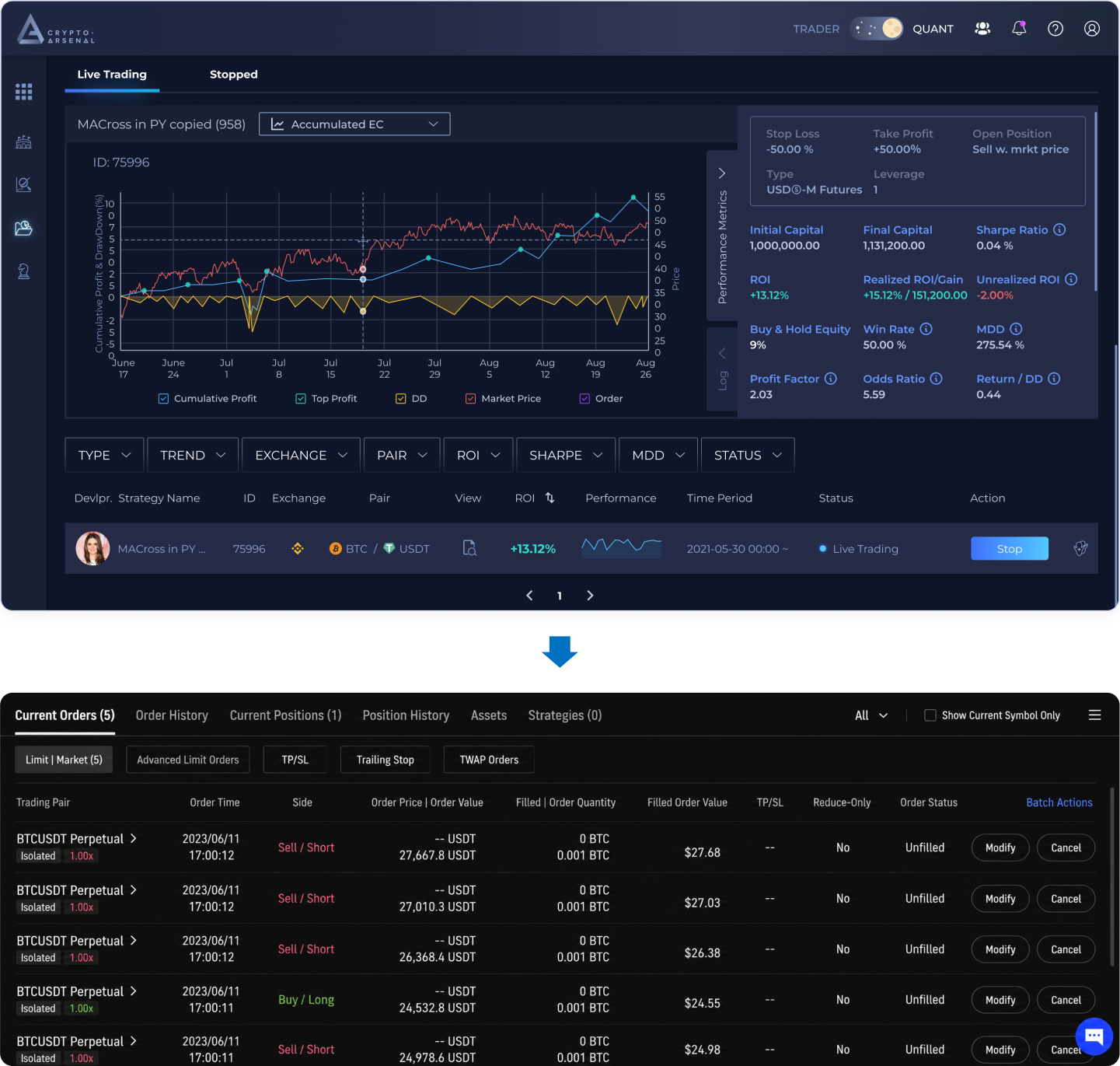
The problem isn't just "can't see the position." When a user closes on the exchange to control single-trade risk, it can wreck the entire strategy — the bot detects that a position it manages has suddenly vanished, its state breaks, and for risk control it can only stop the strategy with no way to recover.
So the direction is clear: bring closing inside CA. A manual close only ends the current position and moves the strategy to flat; when entry conditions are met again, the bot still opens automatically — giving users both the discipline of automated trading and the freedom to manage their own returns.
To let users pick up the flow seamlessly, I benchmarked the real interfaces of Binance / Bybit / OKX, breaking down the position fields, closing flows, and TP/SL flows the three share. Considering also what data the exchanges can return, I converged on an operation flow tailored to CA.
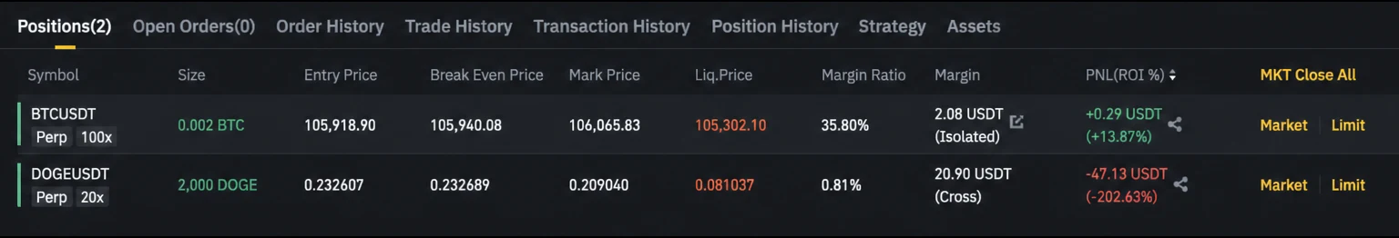
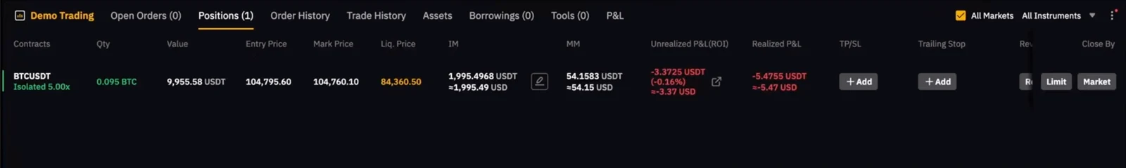
Converged from the three exchanges' interfaces: the most common, exchange-retrievable, and user-relevant fields for a futures position.
Trade Info Tabs
Position, Open Orders, Order History, Position History
Position Fields
Symbol、Side、Size、Entry Price、Mark Price、Liq. Price、Margin、PnL (ROE%)
The three close flows are largely the same: find the position → choose Limit or Market → confirm. The only difference is Binance adds an extra amount / quantity screen. CA follows the same core structure.
TP/SL is two steps everywhere: open the position → set the take-profit / stop-loss trigger price and quantity. CA follows the same structure.
Across Binance, OKX, and Bybit the interfaces and flows are essentially the same — only the UI components differ. CA's two flows therefore follow the same form so users can transition quickly.
Although an initial concept has been developed by referencing exchange-based operations, the trading flow of the CA product still differs from that of exchanges. Exchanges are primarily based on fully manual operations, while CA currently relies on strategy bots to open positions automatically. Traders can then decide, based on their own judgment, when and how much of a position to close manually. Therefore, when introducing manual position closing, take-profit, and stop-loss features into CA, multiple design proposals are needed to further confirm the final interface style and operational flow.
Why It Wasn't Chosen
The trend chart on the left has to shrink, but in terms of hierarchy the chart marks entry and exit points — too small and those become hard to tap. And the right side can't fit all 8–10 columns of exchange data, so some information is inevitably sacrificed.
Why It Wasn't Chosen
Although this version references Binance's current pattern and is familiar to users, CA does not currently have this component, so building it from scratch would take more time.
Through testing with the internal team and engineers, I iterated on several components to further improve the user experience.
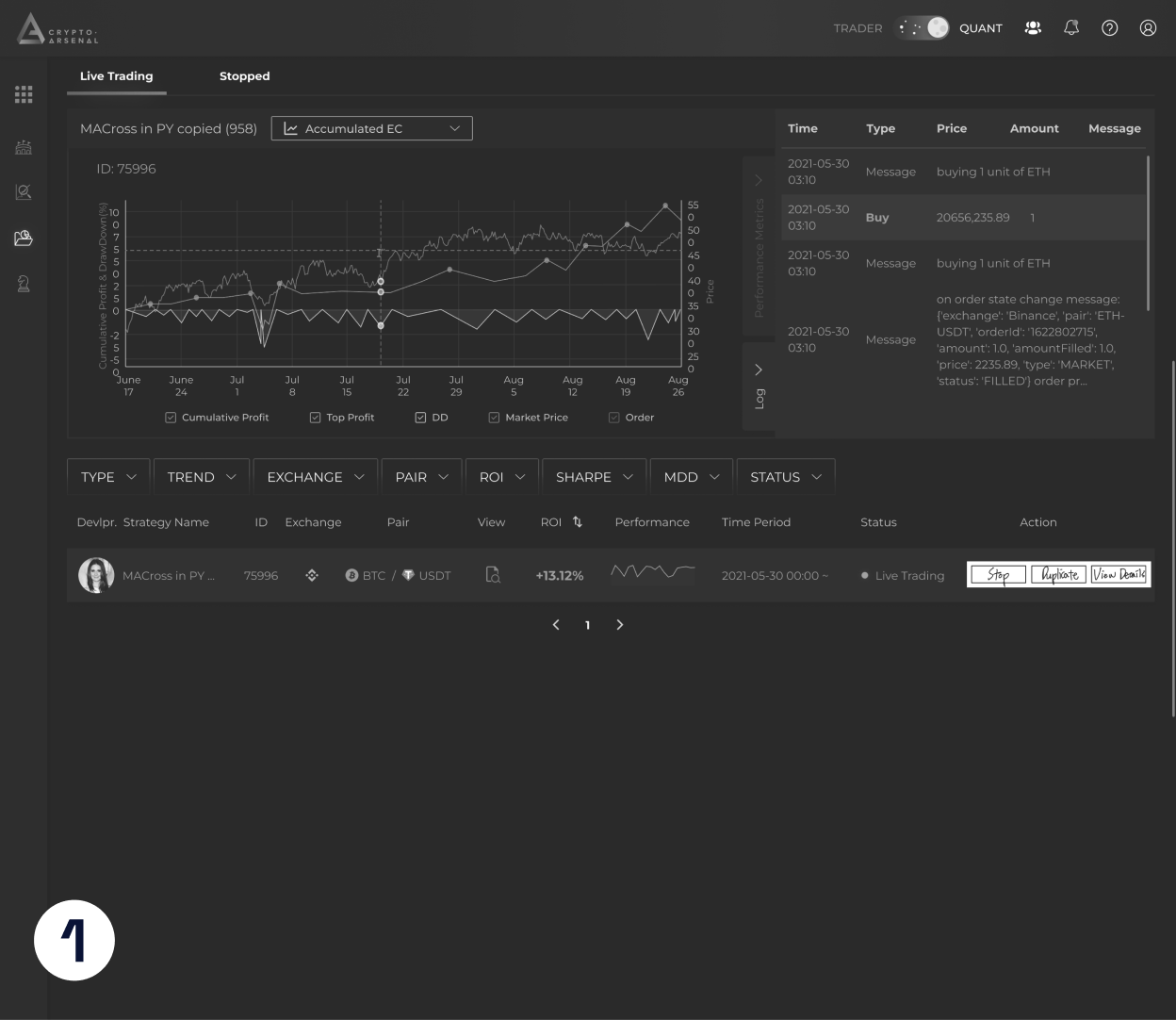
Optimizing Information Hierarchy and Button Consistency in Strategy List
Originally, the list columns displayed both Performance and Time Period at the same time, crowding information in the table and compressing horizontal space. The Action column on the right only had the main Stop button, leaving the Duplicate function hidden or not presented at the same level.
In the revised version, Performance and Time Period are removed from the bottom list and moved to the Accumulated EC chart area. This allows users to directly compare strategy IDs and time ranges when viewing performance curves, eliminating the need to cross-check table columns, clarifying the information hierarchy, and streamlining the list below.
Fixed to match real user needs
The original close-quantity used an input field with a dropdown: users tapped the field, then picked from fixed ratios like 10%, 20%, 50%, 100%. It made common ratios quick to select, but anything off-list had to be typed manually. The expanded dropdown also covered the content below, making the dialog feel cramped.
The revised component became an input field plus a ratio slider. Users adjust the close ratio directly via the slider and see the current value live, e.g. 0%. Compared with a dropdown, a slider better expresses a continuous "0% to 100%" range and makes adjusting the close quantity more intuitive.
Fits how most users work
The original TP/SL explanation sat at the very bottom of the dialog, presenting all rules and limits at once. It let users see everything immediately, but it crowded the main controls with text and felt heavy. For users already familiar with the feature, these long descriptions don't need reading every time — they actually slowed things down and made the interface feel cluttered.
The revision collapsed the full explanation into an info element beside the title, surfacing details only on hover or when the user wants more. This keeps the default state cleaner and lets the main area focus on setting and confirming Take Profit / Stop Loss prices, with less text noise. It serves both novices and experts: experts already know how TP/SL works and a clean interface lets them set up faster for high-frequency use; for novices, the necessary detail isn't removed but tucked into a self-serve info element they can open when they need to understand triggers, scope, or limits.
Aligning intent with the interface
Originally the TP/SL field showed an Add button even after a position already had TP/SL set. That made users think they could "add" another TP/SL order, as if stacking multiple settings on one position. But in CA's logic, TP/SL is a one-time order for the whole position. Once submitted, the next action isn't adding again — it's adjusting the existing setting. So Add created a gap between the interface's meaning and the actual system logic, raising the user's cognitive cost.
After the change, when a position already has TP/SL, the button reads Modify. Users grasp it intuitively: this isn't adding a new TP/SL order but editing the existing whole-position setting. The wording now matches the system logic and reduces misreading of what comes next. Seeing Modify, users naturally register "I'm adjusting the existing whole-position TP/SL," not stacking a new order.
Building on the competitor-flow breakdown and several rounds of proposal weighing, the best-fit approach for CA was distilled, presenting manual close and take-profit/stop-loss in three sequential flows.
There were no resources for formal large-scale user testing during the internship, so I checked how easy the close and TP/SL flows were to learn in two ways: a task-based usability test with five internal members, and metrics I could read straight off the flow itself — such as how many steps a task takes and whether users have to leave the platform.
All five internal members familiar with futures trading completed manual close and TP/SL setup without any prompting.
The close flow matches the existing step count on Binance / OKX / Bybit, so existing traders can pick it up with almost zero learning cost.
Moving all three flows from “hop over to the exchange” to “done inside CA” cuts the average time on task by about 58%.
| Flow | Before (CA → exchange) | After (inside CA) | Reduced |
|---|---|---|---|
| Manual limit close | 65s | 28s | −57% |
| Manual market close | 48s | 19s | −60% |
| Manual TP/SL | 82s | 35s | −57% |
“It works almost exactly like the exchanges I already use — nothing new to learn.”
“I can set close and TP/SL right on the strategy page without switching back to the exchange — so much smoother.”
“I can see at a glance how far each position is from its TP/SL — you couldn't see that in the old CA.”
“Limit and market are clearly separated; I followed the screens and got it right on the first try.”
Method: a task-based usability test with five internal members (each asked to complete the close / TP-SL tasks unaided). These figures come from internal testing and design-flow observations, not live production analytics.
This internship taught me how to make design decisions in a fast-moving product environment: when there were no extra resources for formal user testing, I validated flows quickly with the internal team and engineers, then balanced exchange interaction patterns with CA's existing design system and technical constraints.
On a 1-2 week rhythm, I broke fuzzy product needs into discussable flows, wireframes, and prototypes so the team could align faster and keep delivery moving.
Without extra resources for formal user testing, I used internal team members, engineers, and people familiar with the product flow to quickly test interaction logic and catch issues in information hierarchy, flow comprehension, and implementation constraints early.
When referencing exchange patterns, the goal was not to copy the interface, but to understand familiar user behaviors and translate them through CA's existing design system, risk-control logic, and platform components into a more consistent and feasible solution.